From investment to launch, I led the design process that turned an idea into a cohesive product. Every decision was orchestrated to ensure a new concept felt intuitive and usable.
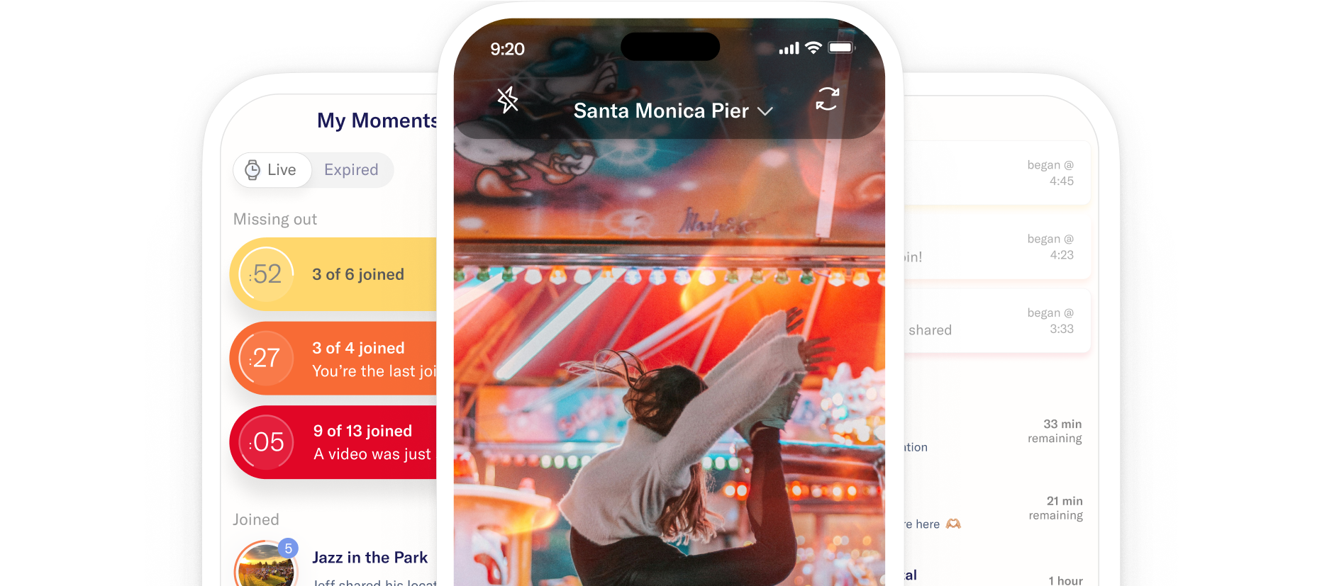
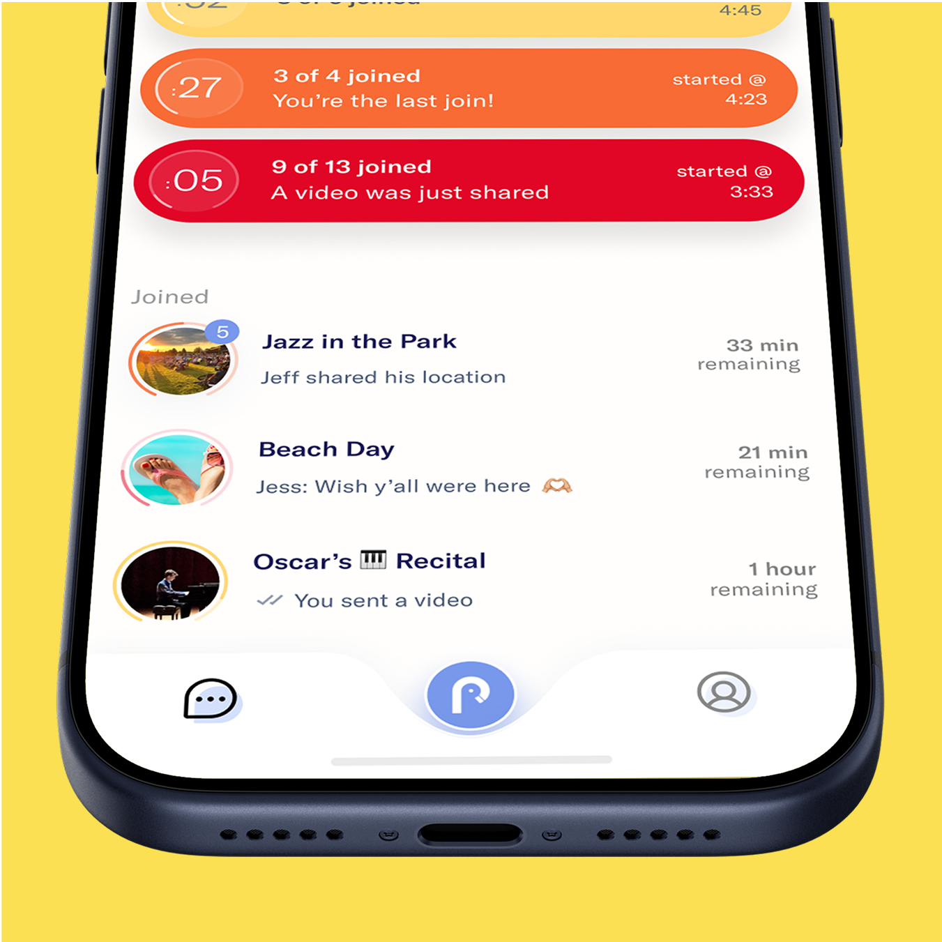
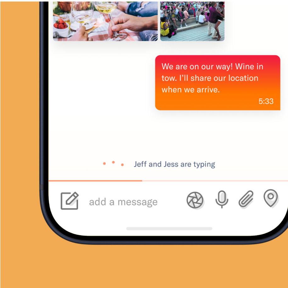
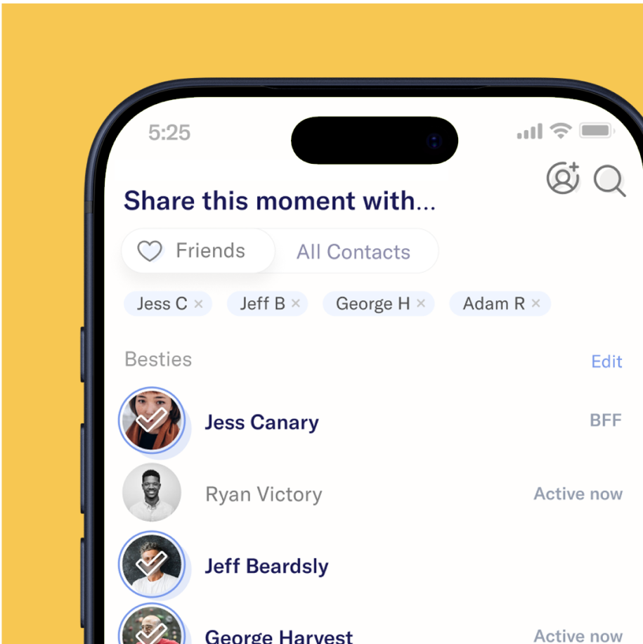
The Poing app was created to cut through the endless clutter of social media. I led the product and design strategy from concept to App Store launch, directing a unified experience where brand, design system, and product were seamlessly connected. Every interaction and visual choice was shaped for immediacy, focus, and meaningful connection. The outcome was a streamlined social platform that gave people clarity in their conversations and control of their moments through an interface that was both intuitive and approachable.
When we began Poing, our hunch was simple: people were tired of noise. Market research confirmed it. Studies showed that 42% of social media users say most posts feel irrelevant, engagement on posts falls off sharply within 24–48 hours, and people increasingly want to connect with close friends over broad networks. Our research validated that ephemerality and context could create focus, not clutter — the foundation for Poing’s design.
Launching Poing required a disciplined process that balanced vision with execution. I led the team through a staged approach that kept us aligned and moving quickly. Our research heavy approach kept designed scope confined, mitigated risk, and ensured Poing launched as a polished product grounded in user-empathy and design precision.

Through diary studies, interviews, and market analysis, we confirmed people were overwhelmed by irrelevant posts, fading relevance, and messy group thread

Through diary studies, interviews, and market analysis, we confirmed people were overwhelmed by irrelevant posts, fading relevance, and messy group threads.

I led iterative design reviews with engineering, executives, and investors, aligning scope and refining details until we launched a seamless "minimal-delightful-experience" experience.